Mga Pahina

Linggo, Hulyo 14, 2013

Fourier Transforms! 2D version: model of image formation

We have already encountered several applications of the Fourier transform during our Applied Physics 183 and 185 class. It is so powerful that one couldn't possibly imagine the fields of Optics and signal/image processing progressing as much as they do nowadays without it. Fourier transforms use the sum of cosines and sines in representing a certain signal. In this activity, we extend it to two-dimensional to mimic the lens of a camera as a Fourier Transformer and this it is represented by the following equation.
One property of the Fourier transform is its symmetry. The following figure schematically presents the 2-D symmetry of FT.
2D-Symmetry of FT 
ref: [2]

You will be able to observe this symmetry when we get to the result of each Fourier transformations done in this activity. 

Fourier transform can be implemented through numerical simulations. Several algorithms have been presented in solving Fourier transform, and the best one so far is the Fast Fourier Transform by Cooley and Tukey[1]. Taking in mind that Fourier transform represents a signal/image as a sum of sines and cosines, we examine the FFT of a synthetic sinusoidal image shown below:

FFT of sinusoid images along the vertical and horizontal axis

The FFT of an image of a sinusoid is relatively much simpler than other images. Its direction is also consistent with the direction of the sinusoid. Note that the FFTs shown in the figure above are zoomed-in versions for us to be able to distinguish their FFTs.

In this activity, we explore the different techniques in implementing the use of Fourier transforms in simulating an imaging device as well as editing and manipulation of images. The first part of the activity is exploring the discrete Fourier transform. We note that FFT2 best works when it's size is in the power of 2. Thus, we create synthetic images of size 128x128 in each of the applications to be explored in this activity. The first task is to create a circle of any radius. In my case, I created three with different radii and each of their FFT and shifted FFT are presented in the following figure.


FFT and shifted FFT of circles of increasing radii

The Fourier transform of an image has to be shifted because the quadrants of the image are interchanged. The resulting image is that of an Airy pattern. As the radius of the circle increases, the airy pattern decreases in size. It is interesting to  find the right radius that would result to an image of an airy pattern fit for the 128x128 px. 

I was also curious what happens if we place the circular object at the edge of a picture. Since Fourier transform detects all frequencies that appear in an image, its output is not necessarily dependent on the actual position of the signal in the image. This is demonstrated by the figure below.


The next task is to simulate an imaging device. An image of a circle represents the aperture of a camera, and the VIP image represents the object to be captured. The FFT of the object is obtained and the circular aperture is shifted. Their product is calculated the inverse is obtained to get the convolved image. The result of increasing aperture size is presented in the following figure. 

Simulation of an imaging device with increasing aperture size (circle)

The object appears more focused as the aperture size increases since the aperture is responsible for the amount of light that is captured by a lens. Simulation of an imaging device is just one of the many applications of the convolution theorem. It is what makes the use of Fourier transform very useful in the fields of Optics and image processing. The key point in this theorem is that:
Multiplication in Real Space <--->  Convolution in Fourier Space
    Convolution in Real Space <--->  Multiplication in Fourier Space


References:
[1] Maricor Soriano. A7 – Fourier Transform Model of Image Formation
[2] The Fourier Transform (What you need to know) . School of Physics, The University of Edinburgh from http://www2.ph.ed.ac.uk/~wjh/teaching/Fourier/documents/booklet.pdf Retrieved 16 July 2013

Huwebes, Hulyo 4, 2013

Image enhancement using histogram manipulation

The next task for our 186 lab class is image enhancement using histogram manipulation. Based from experience, we sometimes fail to set the correct settings in our camera before capturing a scene. Most of the time, (well in my case and based from my own observation and experience), it is a common mistake to take a shot that is dark. There is a certain threshold to which our eyes is sensitive to. In this activity, we can enhance dark images to be able to see more detail about the picture.

I chose the following image of Aeriel during her mock wedding with Nestor last February. As you can see, the image is dark and the objects in front of Aeriel are not clear. Now, suppose we want to enhance the image to make it look brighter and more detailed, we could just manipulate the grayscale PDF of the original image by backprojecting the grayscale values of a desired cummulative distribution of grayscale values.

Image to be enhanced

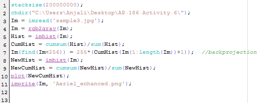
The first step is to get the cumulative histogram (CDF) of the grayscale values of the image and use it to backproject values from the desired one. The CDF of a normal probability distribution function is that of a constant. So in enhancing our image, our goal is to normalize as much as possible the histogram of our image.  The following image shows the original and the enhanced CDF of our image.


As observed, the highest pixel value present in the original image is only about 100 pixels, which is why the image is generally dark.  Recall that in a grayscale image, the brightest pixels are at 255 px. I started by converting a given RGB image into grayscale and plotted its histogram. I then proceeded to computing its CDF and as already mentioned, the result is shown in the left side of the above picture. 

Using the  original and the desired CDFs, the pixel values of the grayscale image is replaced. I remember our 185 class and thought about the input-output curve of a system. In this case, the I-O curve is the desired CDF.


I was not really familiar with the matrix operations here in Scilab and I first opted in using for loop. But then my code was not working and for some reason I couldn't find the bug. Aside from the fact it is slow and faulty, it was not elegant. So then Joshua thought me with the one-line code. I didn't know that Scilab allows operations in each element of a matrix to be done simultaneously. Although the idea is the same, mine was broken down to for loop, where the operation is performed to each element one at a time. I was amazed when I found out that Scilab could handle a matrix operation as one. Indeed, it could be the best tool for image processing.

Finally, I produced the following enhanced image:


Wondering what happened to the histogram of the enhanced image? Here:

Histogram of the enhanced image

Observing it closely and comparing it to the original histogram, I realized that the the points were just basically spread out through the 1-255 range. It was made to follow the normal distribution. Its cumulative distribution is quite more interesting since it wasn't able to follow an exactly straight line. Shown below is the CDF of the enhanced image and the desired (straight line).
CDF of the enhanced image


This method here can also be done without using Scilab. Other free and more user-friendly software are available online. One example is the GIMP. We can use GIMP to manipulate the histogram of a given image the same way we did using Scilab. Now loading the same image in GIMP and following Image > Mode> Grayscale and then Color > Curves, we can adjust the color curves of the image by choosing the preferred input-output curve. In our method using Scilab, we chose a constant line as our I-O curve. A snapshot of the manipulation using GIMP is shown below:


Histogram Manipulation using Color Curve in GIMP (Grayscale)
One also has the option to do this without converting the image to grayscale. The different channels red, green and blue can be manipulated individually as can be seen from the snapshot below:
Histogram Manipulation using Color curve in GIMP (RGB)

This technique can also be done by using other softwares like Photoshop. Here one can simultaneously view the resulting histogram of the image as you vary the I-O response curve. The picture below shows a snapshot of the Curve and the Histogram of the same image loaded to Photoshop.
Histogram Manipulation using Photoshop

Indeed, there are a lot of techniques available in enhancing an image. It is interesting to understand how these software work. Behind their user-friendliness is a deep information that only lucky students like us can be able to understand. For this activity, I give myself a grade of 11/10 for doing all the required work and for further exploring other software. I am looking forward to the next activities. :)


Martes, Hunyo 25, 2013

Area Estimation and Edge Detection

The next task in our 186 lab class is area estimation and edge detection of a given image. Suppose we have an image of a regular shaped object and we wish to obtain its area using pixel values, we can implore the following techniques called the Green's function.

First, we start by generating synthetic images of a regular shaped polygon using Scilab or paint. It is important that we know the dimensions of these synthetic images so that we will have a basis in computing the actual area of the image. I used Scilab to generate these images. The first thing that made me wonder is the question of how big or how small should the be the dimension of the image to produce a more accurate estimation of the area? Or would it be independent of the dimension of the image to be estimated? Would a bigger image dimension give us a more accurate result or would the error be multiplied as well? The formula of the Green's function is shown below:
where Nb is the number of neighboring pixels.
But before we do this, let's discuss first the syntax edge
To be able to track the edge of a figure, we use the function edge which uses different algorithm depending on the choice of the user. An example result for each type of edge detection is shown below:

Synthetic circle generated using Scilab together with the different edges available
Choosing the right algorithm in detecting the edge is very important in area estimation. The sobel and the prewitt use a gradient estimator. From the term gradient itself, we know that the it concerns "rate of change". Thus, this method uses the derivative approximation to find edges. The points where there is a high gradient in an image pixel would be detected.


I tried using all these algorithms in area estimation with the following code:


I was able to write this code after the meeting the activity was given, but it took me so long to debug it. I was so frustrated when I realized my mistakes. Instead of implementing arctan as atan(y,x), I used atan(y./x). Thanks joshua for ranting on me about his mistake! He told me that he made used atan the wrong way. That was when I realized I did the same. Norman also offered help and he pointed out that I got the formula for the Green's function wrong. Funny how all my mistakes are careless ones. I should have my mind more focused on the little matters. When I program something, I tend to focus more on the flow of the commands and execution. I oversee the little ones like wrong index used and/or syntax. I should be more careful now to save time and energy!

Eventually, I was able to estimate the area of the images I have generated using Scilab (circle, square) and Paint (rectangle, triangle). The following table presents the summary of the percent deviations of the estimated area using Green's function with respect to the actual area (pixel count) of the image.


The error in area estimation using sobel is relatively large (~23%). As can be observed from the figure (square) above, only four points are present in representing the square.

To apply this technique, I obtained an image of the QC circle out of the Quezon City map using google maps. The following image is my test image:

area: 52137.393 sq px

It's very interesting that we could actually estimate the area of an image. Indeed, there are a lot of things that can be done using image processing techniques and I'm looking forward to learning more in the next activities. I'm quite sure that these lessons will be very useful in my current research as well as my works in the future. I give myself a grade of 10/10 since I was able to accomplish everything that has to be done, and was able to compare the different edge detecting methods. :)


Miyerkules, Hunyo 19, 2013

exploring image types and formats

It's really hard to write when you are not in the mood to do so. It took me a long time to finally face the fact that this activity is due today and there's no choice for me but to work on it. This activity requires a great deal of effort and patience in reading the histories of all image types! But it's also quite interesting to know more about the reasons why they had to invent/create a lot. What could be the reason why we are still given a choice of what format to use when saving images? Haha. I remember when I was asked by my brother Orly to review his powerpoint presentation for his graduate thesis defense. Much of my attention was on the pictures and plots. I got really really OC about his figures so I asked him to revise some of the images. I remember him saying "Save as .tif para walang mawalang info, wag jpeg", and all I could think was how can you compress an image without losing information? If that's possible then there's really no reason to use other formats anymore! Haha. I was very ignorant back then. So anyway, enough with the back story. Let's get to the real thing.

The title of this blog is "understanding photographs". For us to be able to really understand them, we must learn the different types and formats of images as well as their history. We start then with the four basic types and these are the following:

1. Binary

Binary images consists of values either 1 or 0 per pixel. They can either appear as black and white or it can also be any other two set of colors. Typically, the pixels with values 1 appear as white and pixels with values 0 appear as black. The figure of the hugging zebras shown below is obtained from [1], and the pixel values of an area is manually added to demonstrate the pixel numbering in the original image.


The properties of the original image obtained from the web are the following:


It always struck me how information can still be stored and presented in a way that requires only two colors.


2. Grayscale
Another basic type of image is the grayscale. This type has pixel values in the range [0, 255]. Since each pixel consists only of a single value, grayscale stores the information about the intensity of the image where the brightest value is 255 (white) and the darkest is 0 (black). For this reason, grayscale images are also called monochromatic since they are only composed of a single color of different shades. The picture shown below was captured by my brother Jay Jay Tarun when he and my sister had a vacation in Rome, Italy.


3. Indexed Images
Indexed image is a type of image that stores 8-bit of information as opposed to true color images that's composed of at least 24-bit. This limited size allows file transfer faster and efficient. In this type, the information is not stored per pixel, but in a separate vector called the palette. This is a set of colors specific for the image itself. Each pixel contains information about the index on the image' corresponding palette. [12] 

These types of images are often used as an option/effect in many easy photo editing software. I'd like to think that indexed images are like truecolor images but their colors are not "continuous". It looks like the combination of each pixels were not smoothened.  

An example of an indexed image and a truecolor image

4. Truecolor Images

Truecolor images must be the most common image we encounter in our everyday life. This format, as its name suggest, shows the true color of the image the same way that we see it live with our own eyes. It stores details such as luminosity, brightness and the likes. Each pixel usually stores 24-bit depth of color information, 8-bits each for red, green and blue. An example of a true color image is the flower shown in the above picture.


To better appreciate true colors, we try to compare the image of the flower with the other image types and we can do it by converting it to the other formats. I used Scilab in converting the images The original file size of the true color image is 1.30 Mb which is quite large.

The truecolor image of a flower converted to different types  with their corresponding histogram at the top


I converted the truecolor image to grayscale and binary using Scilab, and the code for doing this is shown below.

Since grayscale images only contain monochromatic colors, it is expected that the file size should decrease since the original RGB combination was flattened to a single layer without losing the information on brightness. The information is represented by the different shades of gray in the image. To know more about this information, I obtained the histogram of the image and is shown below:


For the conversion to indexed image, I used GIMP>Mode>Indexed. The size also decreased.

In converting a truecolor image to binary, one of the requirements for the syntax im2bw is the threshold. To explore this further, I created the following images of increasing threshold. As can be observed from the figure below, there is a certain threshold to which a truecolor image could retain the information. In the example below, the threshold range 0.5 to 0.6 is the most informative. A threshold that is too small would result to an image with a majority of white, while a very high threshold would you an image with a majority of black depending on the true image you have.

Binary image of different threshold

In all of these file types, we can observe that the true color type occupies the highest memory. 
Now, what happens if we crop an image? Would the size decrease too? To know this, I cropped an image with a known size and compared it to the size of the cropped image.
Cropped image
As intuition would tell us, the size of the cropped image indeed decrease. To make the cropping of the image consistent, I exported the image in the same file format. This method is just basically scaling the image size when compressing it.


These file types are sometimes not enough especially if what we need are more informative and more appealing to the eyes. Other subjects such as the sunset, galaxies and volcano lava need a more advanced type in order to capture and give justice to the appearance of the subjects in real life. These advanced type are the following:

1. High dynamic range (HDR)
True color images are normally stored in 24-bit, with 8-bit each grayscale recording [3]. HDR images require more of this to capture the contrast in the light and dark areas of a picture. This is done by taking a picture of a subject multiple times at different exposure levels, and then stitching them together to produce a more detailed image.[2]

High Spectral image obtained from here [2]

2. Multi or hyperspectral image
Normally, true-color images have normal bands of 3 (red, blue and green). In multi-spectral images, images are also captured at a specific band of the electromagnetic spectrum, sometimes even for frequencies that are not part of the visible spectrum such as the infrared. These images of the same scene are then stacked to create a single image. These are normally used in satellite images (hyperspectral). An example of a multispectral image is shown below taken from [5]


3. 3D images

Information of a 3D image can also be stored in different ways. An example of a 3D CT scan is shown below. 3D images are always used in medical fields and enterinatinment.


4. Temporal Images or Videos
A normal image can just take a single snapshop of what really happening. They say a picture paints a thousand words. Now imagine if we have a video of a scene, would it speak a thousand more words, or would it actually limit the possible happenings in our own imaginations? Would it give us enough leeway to explore and think more about the captured moments? An example of a video is embedded below.


Everything has changed, Ed Sheeran ft. Taylor Swift

Aside from these image types, images can also be classified according to file formats. We then go back to the question from the start of this blog. What's the use of saving an image file to a specific format? What makes all the difference? One of the main reasons why users convert images into different formats is to save memory. Although the sizes of images (KB-MB) are comparably small compared to the amount of storage we have today, it is important to note that these images are also sent over the internet, and doing so would require a limited size. Two types of compression have been developed through the years. Their main difference is the characteristic to retain information. These are the lossless image compression and the lossy image compression. [3]

To start with, we have to enumerate the most common formats we have today. I could attest that jpeg must be the most common and familiar image format. This type is the most used especially if an image requires a great deal of color while maintaining the quality and size of the image. To understand these formats, let's try to dive in to their history and several trivia about each one.

1. JPEG - Joint Photographic Experts Group
This type of format is the most widely used in digital cameras and in World Wide Web. It is an example of a lossy image compression which uses a compression technique based on the discrete cosine transform.  JPEG compression gives the user a luxury to choose the amount of compression with trade-off on the quality and size of the image.[7]

2. BMP - bitmap image file or device independent bitmap (DIB) file format
First, we define what is bitmap. Bitmap is "a mapping from some domain  (for example, a range of integers) to bits, that is, values which are zero or one." Basically, bitmap is an array of bits. This array stores information and forms a digital image. [8] 

3. GIF - Graphics Interchange Format
This format was introduced in 1987 and supports up to 8-bit per pixel. It is also an example of a lossless image compressionn which was LZW compression that allows for efficient run-length encoding. It supports animation and up to nowadays, this is the format that is very well known when it comes to saving animated images. [9] Because of its limited support on the number of colors (256), the image shown below demonstrates "discontinuous" color representation as the true color image of the grapes is converted to GIF.

4. TIF - Tagged Image File format
This format is popular among photographers and artists and currently it is under the control of Adobe Systems. Originally, the tiff is created to give a unifying format for a scanned image file. During these times, desktop scanners could only handle a binary image format, and thus tif was just binary. As the technology on scanners blossomed, the tif evolved to handling grayscale images as well as color images. [10] The best thing about tif is that it is a lossless image compression technique which makes it very efficient in preserving both quality and the size of the image.

5. PNG - Portable Network Graphics

This format is the most widely used lossless image compression form in the World Wide Web. It was created as an improved version of the GIF. It is designed to share the information/photos across the web for basic use and not for major photographic needs. Although it was a successor of the GIF format, it does not support animation. Instead, it improves the number of color display of the GIF (at most 256) to more. [11]

The conversions of the images posted here would not have been possible without Scilab. I used different syntax to convert the image I have to the type of image I prefer such as the im2bw, rgb2gray and the likes. Aside from right clicking the image to obtain its properties, we can also use scilab as well as GIMP to obtain the Image properties. In scilab, we can just use the syntax imfinfo.

And that's it! Although this activity is more tedious than the previous ones, it took me a number of times to edit the blog before actually submitting it. For this, I give myself a 12/10 for giving a description for each of the basic types, and exploring the effect of thresholding binary images.


References:
[1] Zebras Hugging Poster for Binary Options Trading Retrieved from http://www.zazzle.com/zebras_hugging_poster_for_binary_options_trading-228649002521143770 on June 18, 2013

[2]  High dynamic range from http://en.wikipedia.org/wiki/File:Leuk01.jpg on June 19, 2013

[3] Dr. Maricor Soriano, A3 – Image Types and Formats

[4] Multi-spectral image from http://en.wikipedia.org/wiki/Multispectral_image Retrieved on June 19, 2013

[5] Multispectral Imaging Moves into the Mainstream from http://www.osa-opn.org/home/articles/volume_23/issue_4/features/multispectral_imaging_moves_into_the_mainstream/#.UcaAv_kwdsl on June 19, 2013

[6] 3D CT scan poster from http://www.cafepress.com/+arteritis_3d_ct_scan_large_poster,664647321 on June 19, 2013

[7]  JPEG from https://en.wikipedia.org/wiki/JPEG on June 19, 2013

[8] BMP file from http://en.wikipedia.org/wiki/BMP_file_format on June 19, 2013

[9] Graphics Interchange Format from http://en.wikipedia.org/wiki/Graphics_Interchange_Format on June 19, 2013

[10] Tagged Image Format from http://en.wikipedia.org/wiki/Tagged_Image_File_Format on June 19, 2013

[11] Portable Network Graphics from https://en.wikipedia.org/wiki/Portable_Network_Graphics on June 19, 2013

[12] What's an index? What's a palette? from http://www.scantips.com/palettes.html on June 19, 2013

Huwebes, Hunyo 13, 2013

Learning Scilab

One of my research problems involves processing of images obtained from my experiments on granular flow, and my adviser suggested that I use Scilab or Matlab since they are more inclined to be used when performing many different image processing techniques.

Today's activity is about the basics of Scilab. By the end of the meeting, we were required to display the plots of the following:
 a. centered square aperture
b. sinusoid along the x-direction (corrugated roof)
c. grating along the x-direction
d. annulus
e. circular aperture with graded transparency (Gaussian transparency).

The first part which is the centered square aperture is more straightforward than the given example which is the centered circle. Figure 1 shows my plot together with the code I used. In my code, there is a luxury to change the width of the square as long as the preferred width is less than 2.

figure 1. Squares of different width


I had to search what corrugated means when I came to know that I have to create a sinusoid along the x-axis with a corrugated roof. Since it is a sinusoid, it is natural that a sine or cosine function is involved. Shown in the following figure is an image of the generated sinusoid with different frequencies. The image shown is the top view of the figure shown just below it.

Figure2. Sinusoids of different frequency with corrugrated roof


Figure 3. 3-D image of the generated sinusoid

I had a hard time generating the image of a grating just because I used the wrong way of plotting. I already thought about using the same technique with the one I used in generating the sinusoid. I used the code 

f = scf();
grayplot(x,y,A);
f.color_map = graycolormap(32);

but I ended up having a grading but with shades of gray at the edge of every color as shown below:

Instead of using this code, I just used imshow and voila, I was able to eliminate the gray colors. :) The generated images are shown in Figure 4. I used different frequencies to vary the number of gratings.

Figure 4. Gratings of different frequencies


In generating the annulus, I just introduced a small variation in the original code of the circular aperture. Shown in Figure 4 is the result of varying the inner and outer radius of the annulus. Instead of converting all values below a certain radius (outer), we restrict the change of values up to a certain smaller radius only (inner radius). 


Figure 5. Annuli of different inner and outer radii

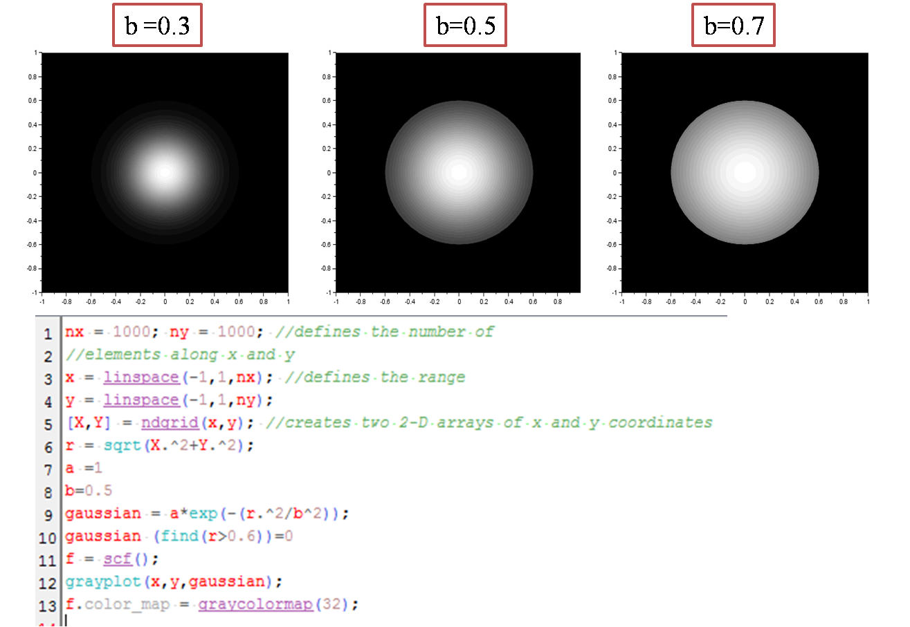
The last figure to be generated is the circular aperture with graded Gaussian transparency. This part was a little more challenging than the previous images since it requires a Gaussian transparency gradient. 


Figure 6. Circular apertures of different graded transparency with radius =0.6


The last part leaves the students to explore more about the possible images that can be generated when combining the different techniques used in generating the different shapes. I was able to generate the following images:


I tried multiplying the matrices element by element and this is what I got. Quite cute! :D

In this last part, I explored the syntax mesh and randomly applied it to my code in generating a circular aperture with a graded gaussian transparency. Voila! :D


I enjoyed this activity and I'm looking forward to learning more programming techniques. :) Overall, I give myself a grade of 12/10 for exploring several parameters that could vary the resulting image.


Martes, Hunyo 11, 2013

Reconstructing graphs from a digitally scanned plot

Nowadays, journals and articles are released online which can easily be downloaded by the readers. These include plots and figures in a digital form. In the past, however, the construction of plots in journals and articles are oftentimes hand-drawn. If suppose you need to incorporate the plot from a very old reference, digital scanning and reconstruction of plots from a digital copy can be applied to be able to extract the information (eg, plot) and be able to use it in a digital form.

Figure 1 is an example of a digitally scanned hand-drawn graph obtained from a thesis manuscript published on the year 1980 [1]. In reconstructing plots from a digital copy, it is important that the original copy contains the correct coordinate label. Using the software GIMP or Paint (in my case, I used paint), we can extract the pixel values of each point in the plot and derive an equation that would relate the pixel value to its corresponding actual value in the plot. The good thing about my image is that, it already contains grid that guide the readers about its coordinate.
Figure 1. Digitally scanned copy of a hand-drawn plot from a thesis manuscript
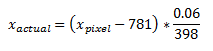
My first thoughts regarding the problem involves obtaining enough number of data points (pixel values) from the plot and then find an equation that would relate the pixel values to the actual values. At first, I was thinking of using the pixels at the origin as my point of translation. Since the origin of the plot is located at a pixel value x equal to 781 and a pixel value y equal to 2469, I could just use these as my reference so that the equations that would relate the actual values to the pixel values are the following:

The fraction 0.06/398 are obtained by determining the number of pixels between each grid in the plot. From figure 1, the number of pixels in each 0.06 intervals in the x-axis are averaged. The same method was done for the y-axis.

The following figure displays the result of the image reconstruction with the original image overlaid with the reconstructed plot. In overlaying the images, it is important that the origin and the maximum value of the plot follows that of the reconstructed so that there is no induced bias in comparing the plots. This can be done by cropping the plot from the original image and then use it as a background for the plot in excel. I would like to thank Alix for teaching me how to overlay the images. :)

Figure 2. Reconstructed plot using translation of origin


The problem I encountered in the first method was that the image I obtained is not perpendicularly scanned. With the use of GIMP, the image was gradually rotated. I tried to get the correct angle that should be used to rotate the image to obtain a perfectly perpendicular image, and that is just by taking the x and y pixel values of the y-axis and then use the known trigonometric identities (arctan).

Later did I realize that I could actually convert each pixel value to its corresponding actual value and then I could obtain an equation that would relate them with the use of a linear regression since I have a set of pixel and actual values. I was not really paying enough attention to what was discussed by Dr Soriano during class, so it was only just during the time that I was writing this blog that I realized that linear regression of the pixel and actual values is more straightforward and is easier. And then it occurred to me that she wrote something at the board about obtaining an equation of a line that relates the pixel and actual values for both x and y axes. That's it! It all made sense now :D

With the use of the pixel values of all labeled coordinates extracted from each axis of the plot, I obtained a linear regression of the actual x values and y values of the plot in relation to its x pixels and y pixels, respectively. This together with the equation of the linear regression is shown in the following figure. To be able to obtain a larger number of data points for the y-axis, I counted the number of grid displayed on Paint between values 0.5 and 1.0 and then I divided it to two to obtain a pixel value for 0.75. This was also done to obtain a pixel value of 0.25. 

Figure 3. Pixel conversions in both x and y axes obtained using linear regression


The x and y pixel values of points in the plot are tabulated. It is not necessary that we obtain all pixel values that corresponds to the plot. In my case, I only obtained 88 x and y pixel values. This part of the experiment is the most exhausting since it requires the use of two programs simultaneously (excel for recording and paint for pixel value extraction). I suggest that you you either minimize the size of the windows for each application or use only the 2 programs needed so you could easily switch from one application to another.

Using the equations obtained using the linear regression, the pixel values extracted are then converted to their actual values. Finally, the points are plotted and the digitally scanned copy is overlaid at the background. The result is shown in figure 4.

Figure 4. Reconstructed plot using linear regression of pixel-value conversions
Based from the results, we could see that there's really no significant difference between the two methods. When the fraction (pixel conversion) in the equations proposed in the first method is distributed such that the equation follows the slope formula, it basically reduces to an equation almost the same from the result of the linear regression. Having accomplished both methods, I could say that the second method is more straightforward than the first, since you need not obtain the pixel value of the origin as long as you have the correct x and y axis pixel to actual value conversion.

I remember doing this activity in my 3rd year as part of my skill building training for research when I was freshly admitted from the Instrumentation Physics Laboratory. Back then, I only used the second method, and it was a little exhausting. Overall, I would give myself a grade of 11/10.


References:
[1] Domingo, Zenaida (1980) Computer simulation of the focusing properties of selected solar concentrations, M.S. Thesis. UP Diliman
[2] M. Soriano. Applied Physics 186 Manual A2 - Digital Scanning